Discovering Complementary Colors (with Free Color Wheel Printable)
Last updated: April 28, 2025 by Michelle
When I was a kid, I loved colors and would mix and match them with abandon. Perhaps you were the same. Maybe you’re still doing it. But have you ever wanted to learn how and why certain colors work better together than others? Learning about complementary colors may seem daunting, but it’s not as complicated as you think. We’ve broken it down so you can understand everything about complementary colors in art and other aspects of life.
So what are complementary colors? We’ll dive into that as well as everything you need to know about the color wheel, exploring what makes opposite colors, and unlocking the secrets of the complementary color wheel. We've also provided three free color wheel printables to reference throughout your artistic experimentations so you always know how to pick colors that go together. Color is an integral part of art, and using colors that go well together is SO important. Knowing what colors work well together can even be handy for picking out clothes! Grab your paintbrushes and get experimenting.
What are Complementary Colors?
Free! Color Wheel Download
Simple Color Theory
Mixing Complementary Colors
Basic Complementary Colors
How to Use
Frequently Asked Questions
What Are Complementary Colors in Art?
Complementary colors are simply pairs of colors that are opposite each other on the color wheel. If you don’t have a color wheel in your head, don’t worry. Most people don’t. But you might know some complementary colors already. Every time you ask yourself how to pick colors that go together, you’re thinking about color theory. Complementary colors show up a lot because when placed together, they make for super striking and eye-catching combinations.
For example, a lot of sports teams will use complementary colors, like blue and orange, on their uniforms. See? You already know what complementary colors are. You simply didn’t have a word for them yet!
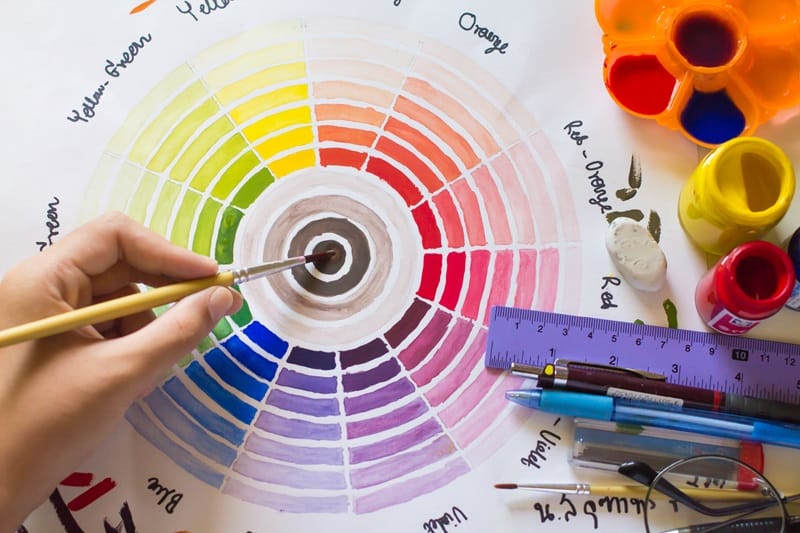
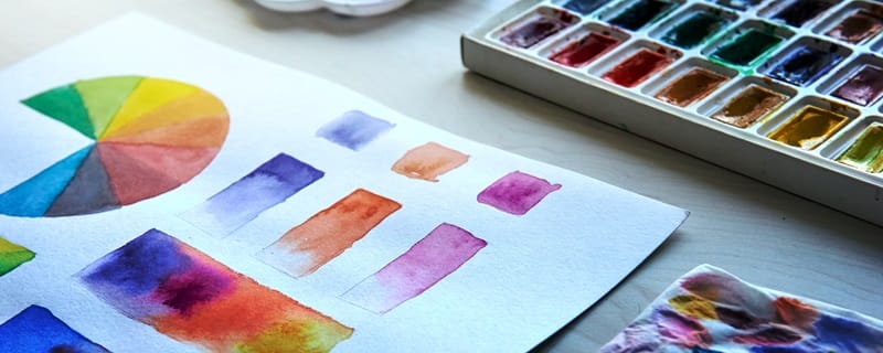
Free Printable Color Wheel to Download
First thing’s first! Download your free printable color wheel to make it easier to follow along as we get into the theory behind “what are complementary colors.” Not to mention that you can keep this to reference during your coloring adventures!
These printables are for personal, non-commercial use only.


What Does Color Theory Mean?
Color theory is the science and art of using color. When you ask “what are complementary colors,” you’re engaging with color theory. It helps us understand how colors interact, how to mix them, and how to pick colors that go together. The color wheel is a crucial tool in color theory, helping us visualize the relationships between colors. By understanding color theory, we can create beautiful paintings, design eye-catching posters, and even pick out the perfect outfit!
Mixing Complementary Colors
You might think of complementary colors as belonging purely to the realm of art, but there’s a science to them as well. Mixing complementary colors is like any other experiment. When you put complementary colors together, you’ll get gray or brown thanks to the way these opposites cancel each other out. For example, mixing red and green paint will give you a brownish color. This is a fun way to explore the science of color and see how different hues interact with each other. It’s also a great demonstration of what complementary colors are, since it shows how them being opposites produces a tangible result.
Basic Complementary Colors
You should be able to spot the basic complementary colors right away. They are the colors you know best, like red and green, blue and orange, or yellow and purple. We find these pairs a lot, and we often instinctively recognize them as opposites. They are the most basic answer to the question “what are complementary colors,” and when they’re side by side they clash in ways that are vibrant and eye-catching.

How to Use Complementary Colors
Now that you know all about complementary colors, you can use them. Create artwork, decorate your home, or pick which colors go together in an outfit using what you learned above. Here are a few tips:
In art, be sure to use complementary colors to highlight eye-catching elements in your painting or drawing. For example, a bright orange sunset against a deep blue sky will draw the eye.
In design, complementary colors are great for creating attention-grabbing posters or even websites. For example, a red button on a green background will stand out and make you want to click.
In fashion, wearing complementary colors can really make your outfit pop. Experimenting with these colors is so much fun! Try pairing a blue dress with orange accessories for a really bold look.
Frequently Asked Questions About Complementary Colors
Still wanting to know more? Maybe some of these FAQs will help!
What Are the 3 Main Complementary Color Schemes?
These are the three you probably already know. They’re the three you likely see the most. They consist of a primary color and a secondary color:
- Red and Green
- Blue and Orange
- Yellow and Purple
What Are the 6 Sets of Complementary Colors?
These sets include the three above, as well as some tertiary colors not included in the three main sets. There are six of these, and they are as follows:
- Red and Green
- Blue and Orange
- Yellow and Purple
- Red-Orange and Blue-Green
- Yellow-Green and Red-Purple
- Blue-Purple and Yellow-Orange
What Are the 12 Complementary Colors?
Delving deeper still, the 12 complementary colors include more tertiary colors, which are easily created by mixing a primary color with a secondary color. You can open up a ton of creative possibilities by learning these complementary color sets as well. Here they are:
- Red and Green
- Blue and Orange
- Yellow and Purple
- Red-Orange and Blue-Green
- Yellow-Green and Red-Purple
- Blue-Purple and Yellow-Orange
- Red-Purple and Yellow-Green
- Blue-Green and Red-Orange
- Yellow-Orange and Blue-Purple
- Green-Blue and Red-Orange
- Orange-Yellow and Blue-Purple
- Purple-Red and Yellow-Green
What are the Complementary Color Tones?
Even when we are talking about complementary colors, there are still shades, tints, and tones we can apply. You make shades by adding black, tints by adding white, and tones by adding gray. All of these change the colors you’re working with, whether they’re complementary colors or not. Using different tones of complementary colors can add depth and interest to your artsy designs.
What Are the Four Color Complementaries?
This just means four colors that are evenly spaced apart on the color wheel. Take a look at the printables we offered above. You may notice that purple, vermillion, yellow, and teal make a sort of cross shape. They’re all equal distance apart from each other on the color wheel. That makes them four color complementaries.
Using four color complements together can be a little bit tricky, but it can result in stunning designs. The best way to learn about them is to experiment and see for yourself how different color combinations work together.
Mixing Colors with Color Theory
Congrats on unlocking your new complementary color superpowers by learning all about “what are complementary colors.” Understanding and using complementary colors is essential if you want to decorate your house, paint a stunning image, or dress to impress. And it’s not as hard as it sounds! If you’re ever feeling overwhelmed about what complementary colors are, refer to the color wheel printables we provided above or experiment and see what happens. In science and in art, we aren’t out for perfection, so give yourself permission to mess up along your learning journey.
Oh, and if you’re still wondering if mustard yellow goes with neon orange, the answer is no!
Complementary Colors | Red and Blue Make Purple | Mixing Blue and Pink | Green and Yellow Make | Blue and Green Make | Pink and Green Make | What Does Orange and Blue Make? | Red and Green Make Brown | What Color Does Green and Orange Make? | Purple and Yellow Make Mauve | Red and Purple Make